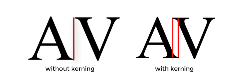
Kerning
Kerning is the amount of space placed between two glyphs (or representation of a character). This is not to be consufed with tracking, which is the consistant degree of space between all charaters.

To adjust how glyphs are spaced, use the font-kerning: property.
* {
  font-kerning: auto;
}
font-kerning: accepts these term values:
auto(default, the browser determins)normal(use information stored in the font)none(disable font’s kerning)
“Should I adjust the kerning?”
Adjusting the kerning of a font in web typography is not often needed.
You’ll notice that adjusting kerning below creates only a subtle difference. Well-kerned fonts are uniform and pleasant to read, and have specified kerning stored in them which is applied by default.
This does not mean you shouldn’t consider the kerning of the font, or changing it; just that your decision should be an informed one.